
The postman brought a delivery from Tara Books, India yesterday. This is a book that Sirish Rao and I have worked on. The project was introduced to me by Tara’s editor V Geetha and has been incubating in our collective minds for a long time. The available English translation felt too big and complex to illustrate and design, and I felt a bit overwhelmed by it. The project finally fell into place when Sirish came up with a highly visual translation of the original author Morgernstern’s text. My job was to typographically ‘illustrate’ the text and design the book.
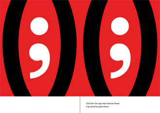
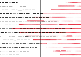
I enjoy the challenges of approaching typography as sign, mark and image. For me, this is process takes me back to the origins of language – where letters are marks and images that can be read both ‘textually’ and ‘visually’. The word is a mark on a page. At very first glance, the word is first and foremost an image.
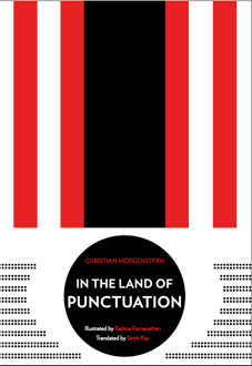
As the blurb on the book reads: First published in 1905, German poet Christian Morgernstern’s Im Reich der Interpunktionen (In the Land of Punctuation) is a brilliant comic poem on language. Morgernstern called it a linguistic caprice; and it is a fun romp, populated by punctuation marks as characters with their own agendas … and yet the political undertones are unmistakable, suggesting systems of control that go beyond language.

An excerpt from an email to publisher Gita Wolf explains part of my process: I’ve taken a modernist (some may say militaristic approach) to the design. What I liked most about Sirish’s text was the visual but also staccato nature of the text. I’ve tried to maintain this by giving a very left-right, turn page, left-right, turn page rhythm to the book.
Other thoughts: Besides the obvious political nature of the text, I’ve envisioned this as a modern, contemporary conflict with visual allusions technology, machinery, war…Influences have been, amongst other things, the structures and rigour of letterpress and metal type, Russian posters of the 1920s and 1930s, the work of Werkman and modernists such as Weingart.
The look right now is flat and graphic – but this is the artwork. I envision the printed version as having uneven texture. Also, as with letterpress, if the black is printed first and the red after, then both layers should be visible… we can experiment.
The book is available here and was featured in Wallpaper magazine’s Reborn in India issue.
book,experiment,failure,Indian,language,typography,-